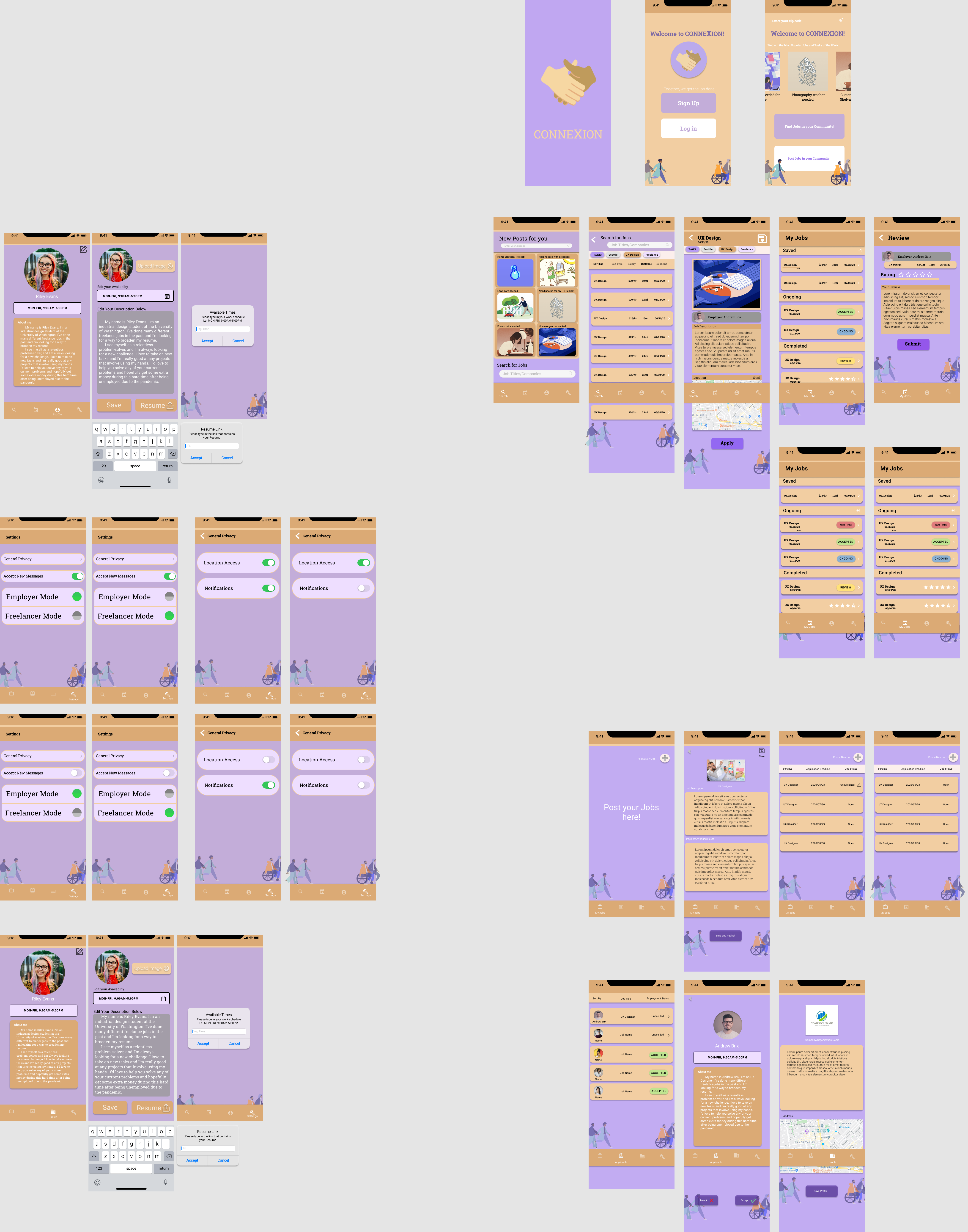
Next-level job-finding product for connecting free-lance workers and local businesses.

Under the effect of the ongoing pandemic, our main target audiences are out-of-work individuals who are actively looking for small part-time jobs and local businesses. We know bringing in an income can be difficult for many people now, so we’re hoping that our product can help bring in small-paying jobs.
Lorem ipsum dolor sit amet, consectetur adipiscing elit. Suspendisse varius enim in eros elementum tristique. Duis cursus, mi quis viverra ornare, eros dolor interdum nulla, ut commodo diam libero vitae erat. Aenean faucibus nibh et justo cursus id rutrum lorem imperdiet. Nunc ut sem vitae risus tristique posuere.
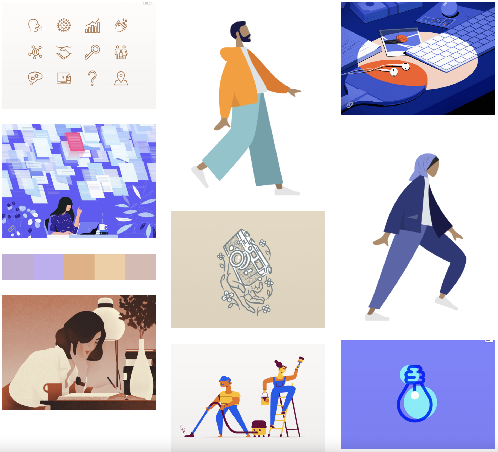
○ Calmness, pretty, organized, simple, representations of jobs, icons of different jobs
○ Tan, light purple, white
○ People are shown as the forefront of the app
Roboto Slab is clean, clear, and grounded. It is very legible and gets the job done. As many of our users are quite busy, this will prevent any distractions that a more intricate, ornate font could have made. However, Roboto also has a rounder, friendlier shape to it 19 that will keep the overall theme of our app inviting and approachable. It was also designed for mobile use by Google and has been used across many Android devices.
Purple is also known to represent ambition and creativity. The app is a solution for people who may be stressed in their job search or getting work done. The experience should help ease the process and visually do so as well. The shades of tan are good neutrals that also help ground the color palette as a whole. The tans and white can be used for backgrounds and larger spaces. The purples will be used for headers, boarders, pops of color, etc.
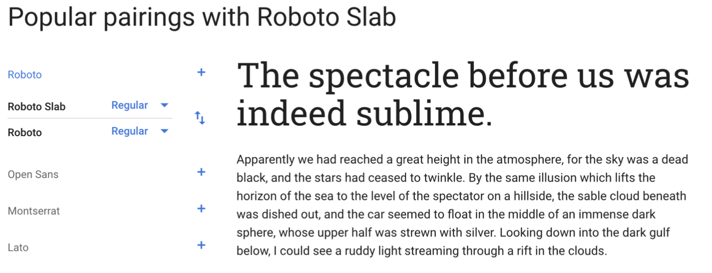
Roboto Slab for titles and Roboto for text.
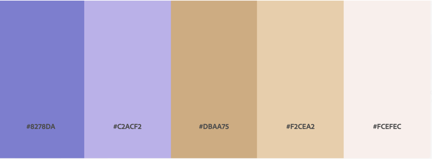
The light purple mixed with the warmer toned tans create a calm and inviting place.